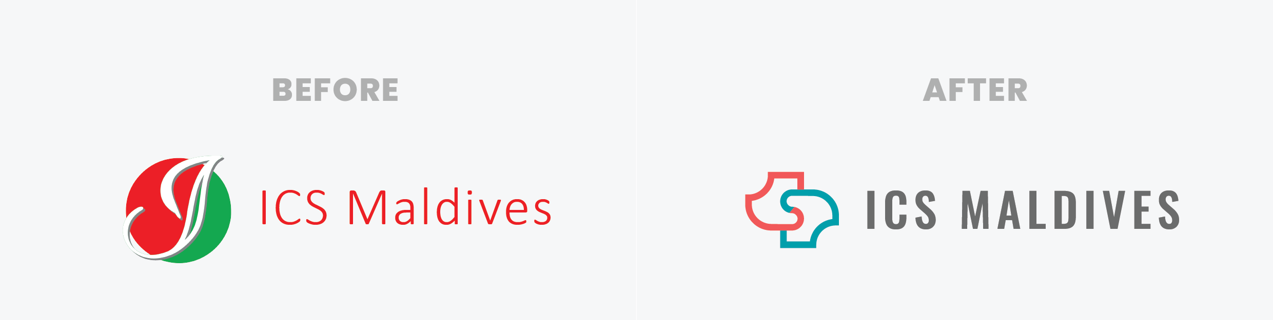
Preferences: Modern look and feel, resemble company’s past as well as the owner’s vision for the future, the letters I, C and S, with bold color(s) and features.
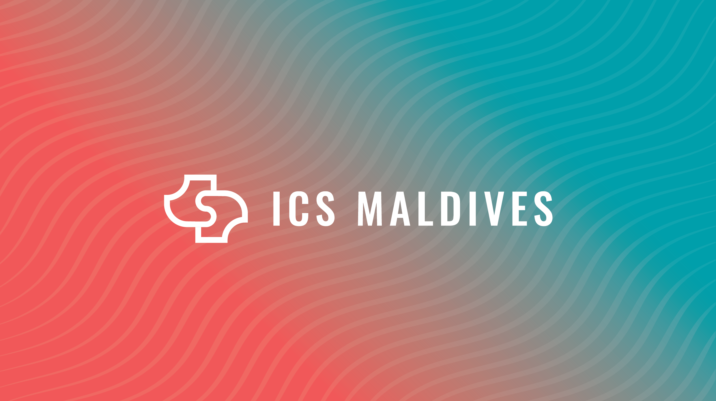
Concept: The brand update highlights its growth while staying true to core values like trust and partnership.
Icon:
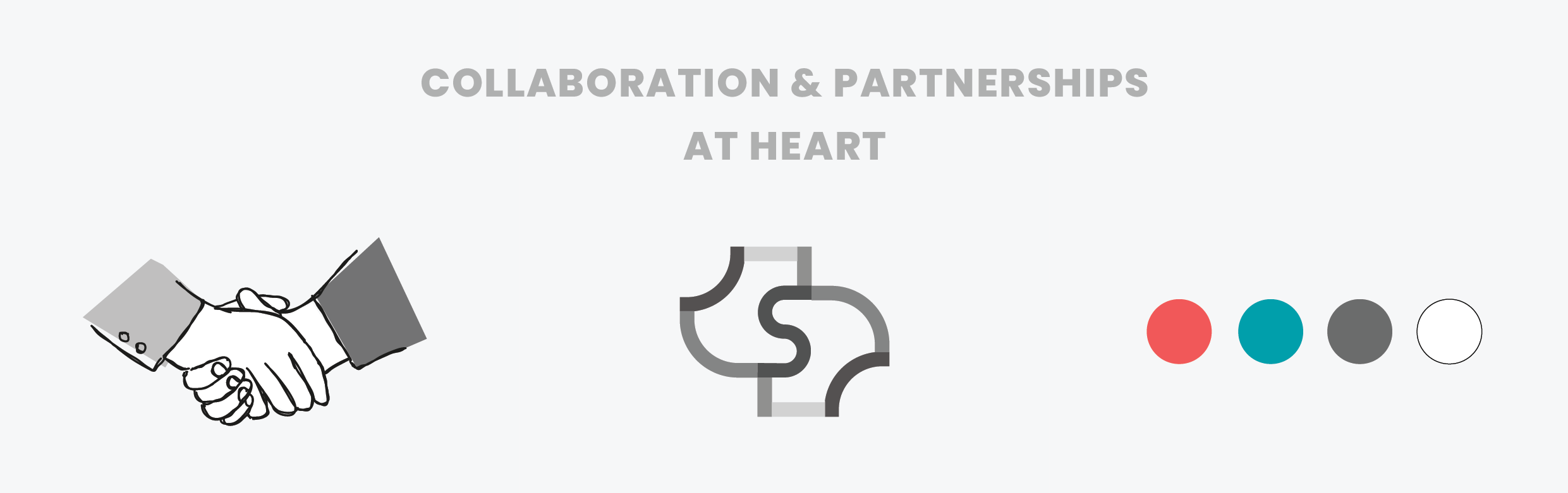
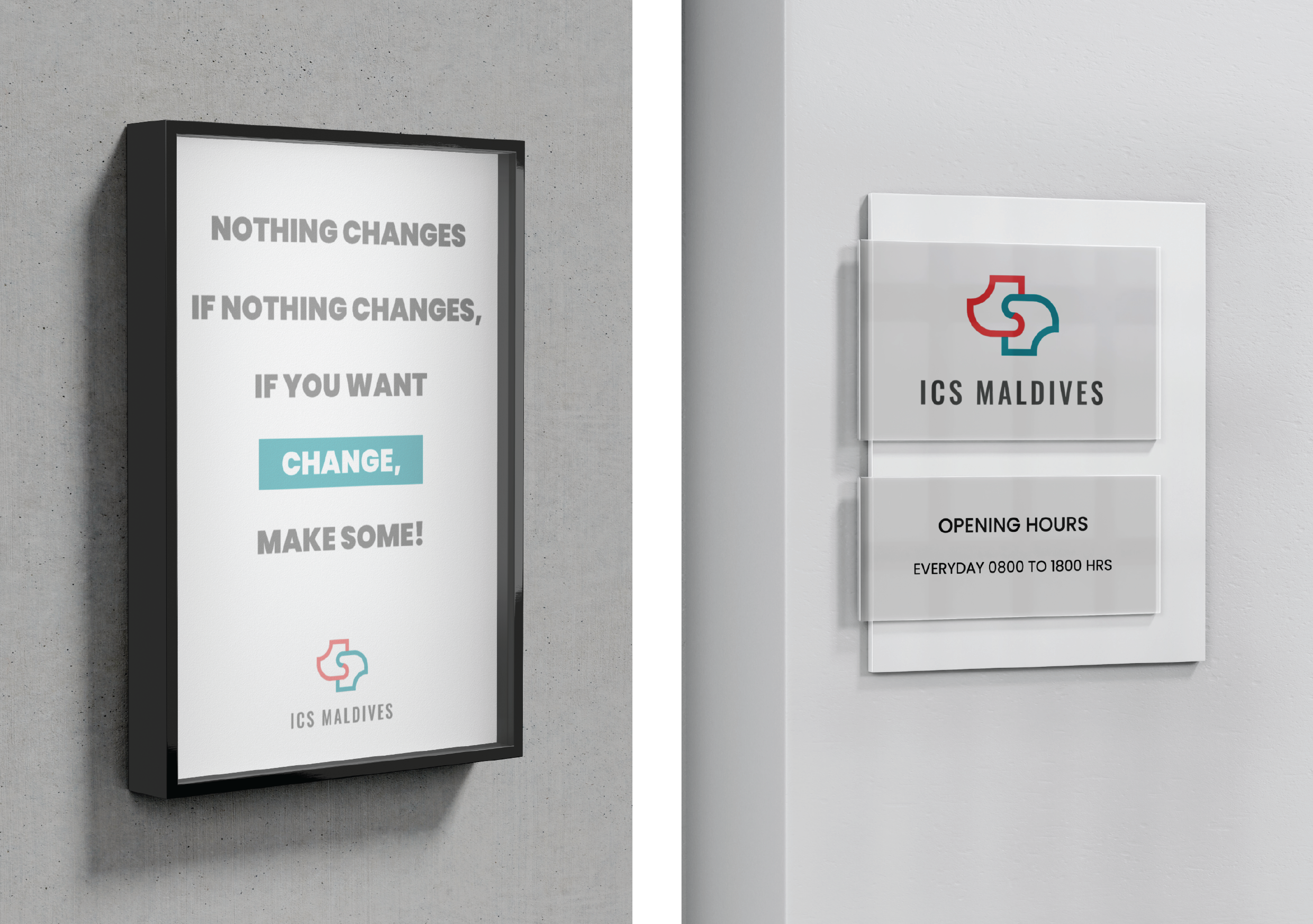
The abstract, interlocking design suggests collaboration and problem-solving, with soft curves creating an approachable feel.
The incorporation of the letters “ICS” and a handshake in the icon visually symbolizes collaboration and the problem-solving approach that defines ICS.
The puzzle-like shape subtly represents fitting solutions together, which resonates with ICS’s consulting mission.
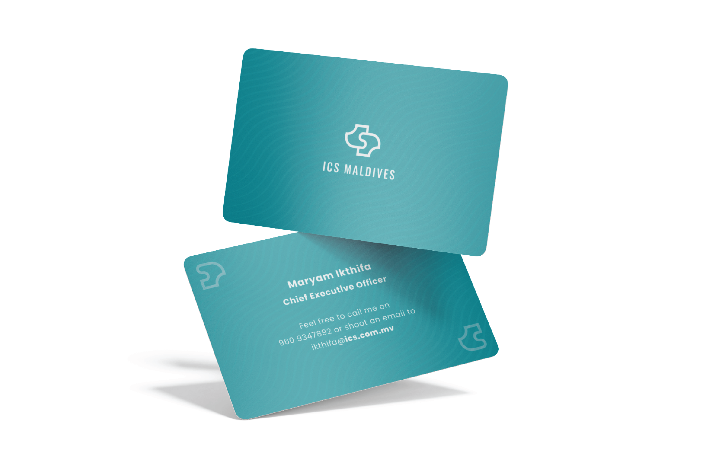
Color: The colors used in this branding were inherited from ICS’s original branding, adopting modern hues. It conveys energy, vitality, and forward-thinking. The grey typeface balances this with professionalism and stability, aligning with the company’s consultancy focus.
The green, also sourced from ICS’s old branding, now symbolizes sustainability and environmental responsibility. This clear differentiation aligns the sub-brand with CSR efforts, giving each brand its own distinct color identity while preserving the historical link.
This branding strategy honors ICS’s past and legacy as a multidisciplinary firm as well as a force for social and environmental change, grounded in the same values.