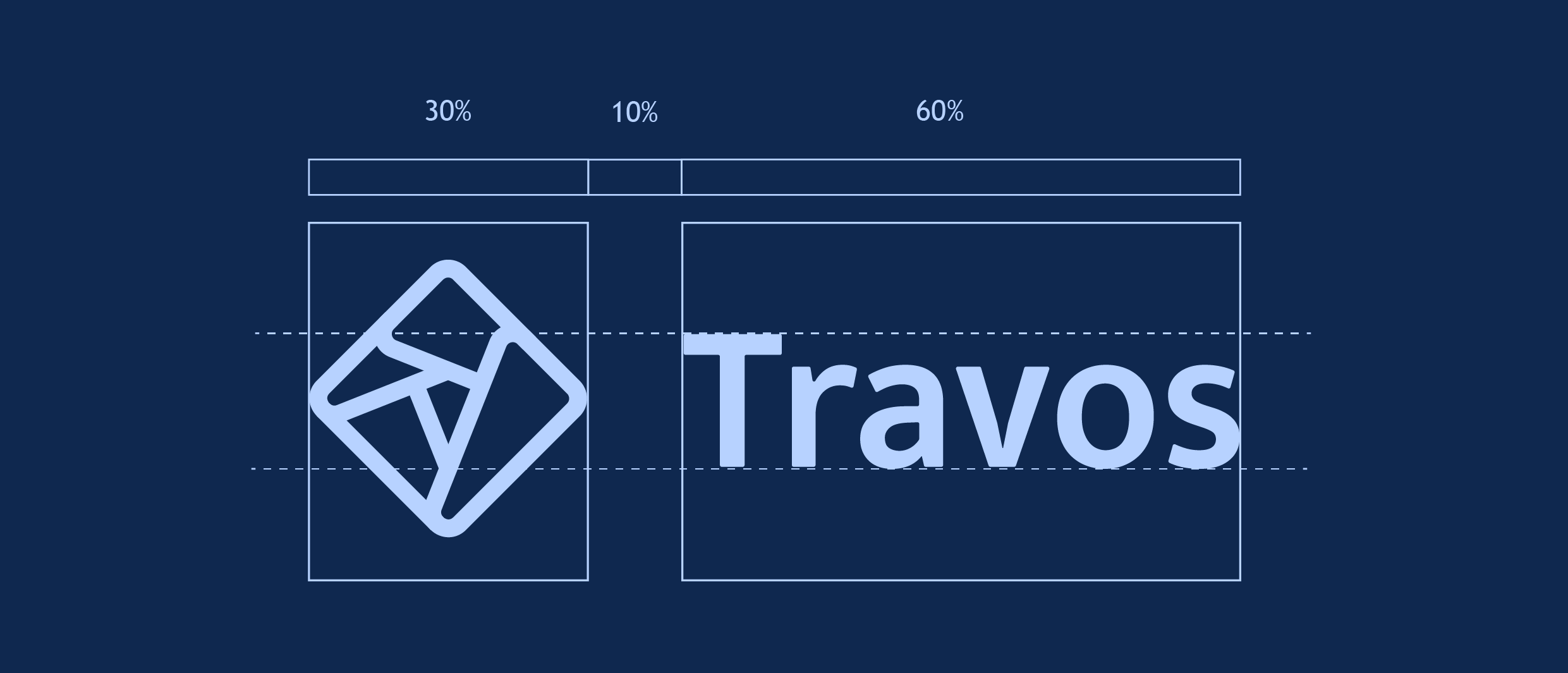
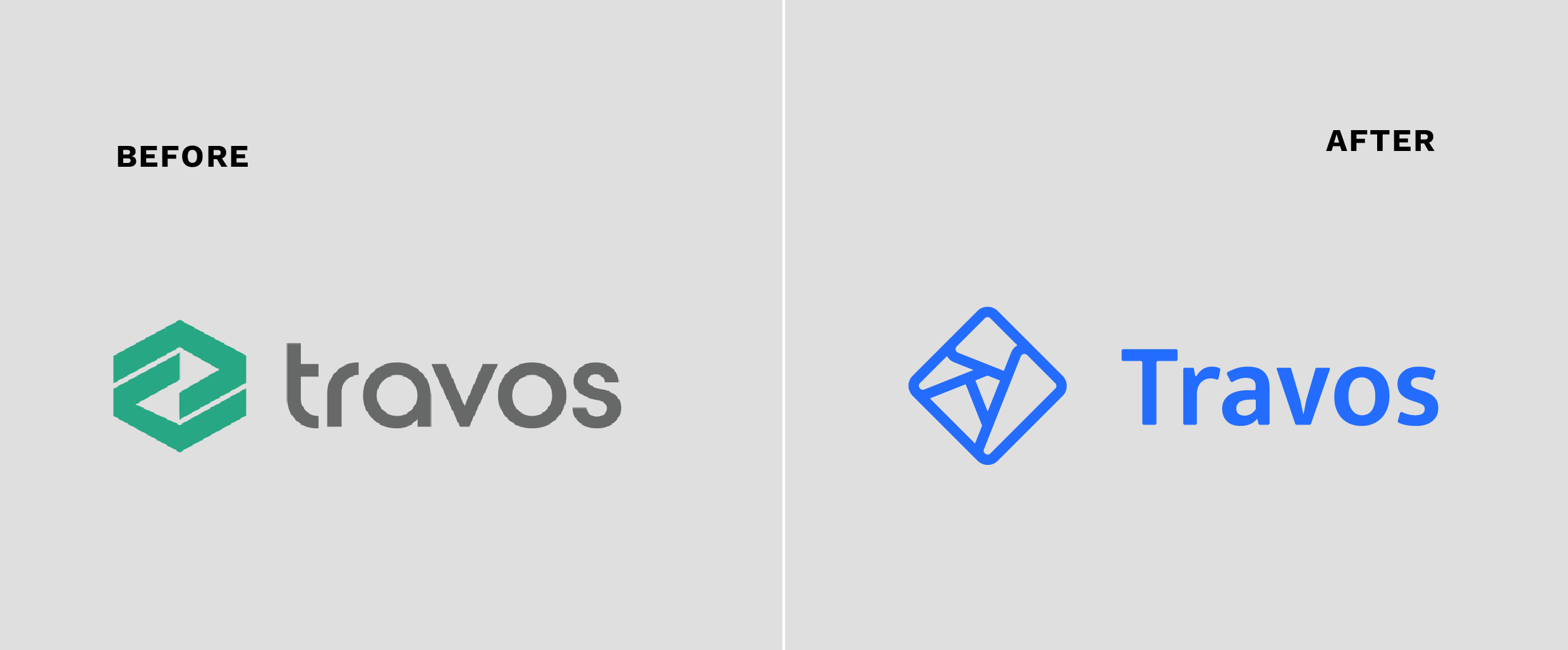
Concept: The branding of Travos emphasizes simplicity and efficiency, aligning with its nature as a SaaS tool aimed at enhancing business productivity. The clean lines of the logo convey structure, while the abstract shape reflects the idea of streamlined solutions.
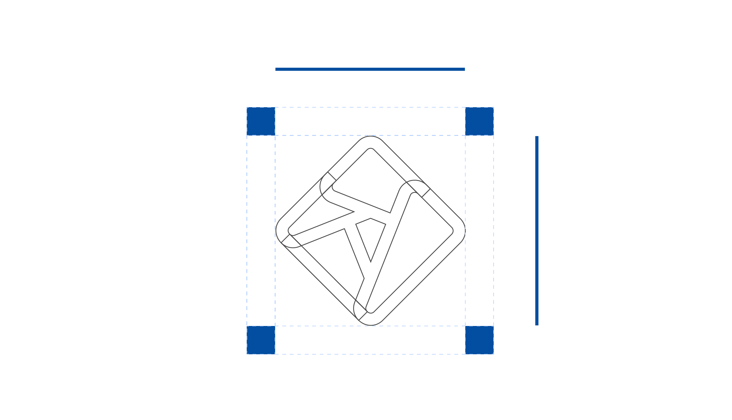
Logo: Inspired from the initial design the owner’s created for Travos, the new logo icon is geometric, suggesting precision, organization, and forward-thinking- key elements for a management app. It resembles interconnected nodes, representing networks or business systems.
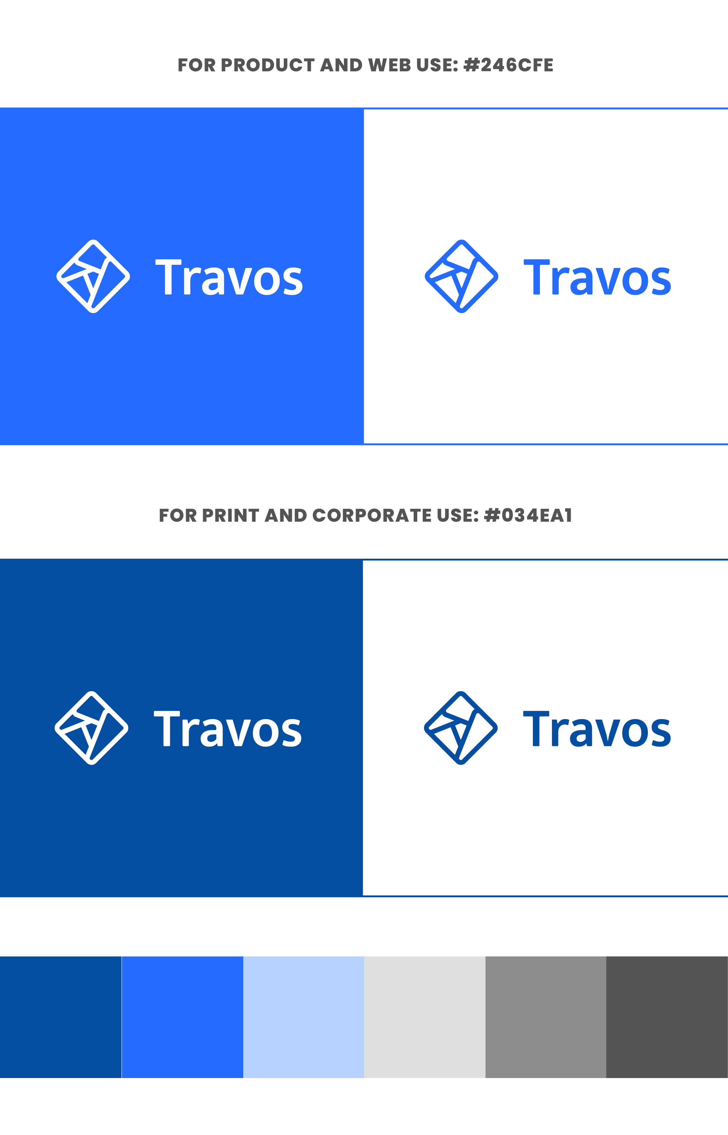
Color Palette:
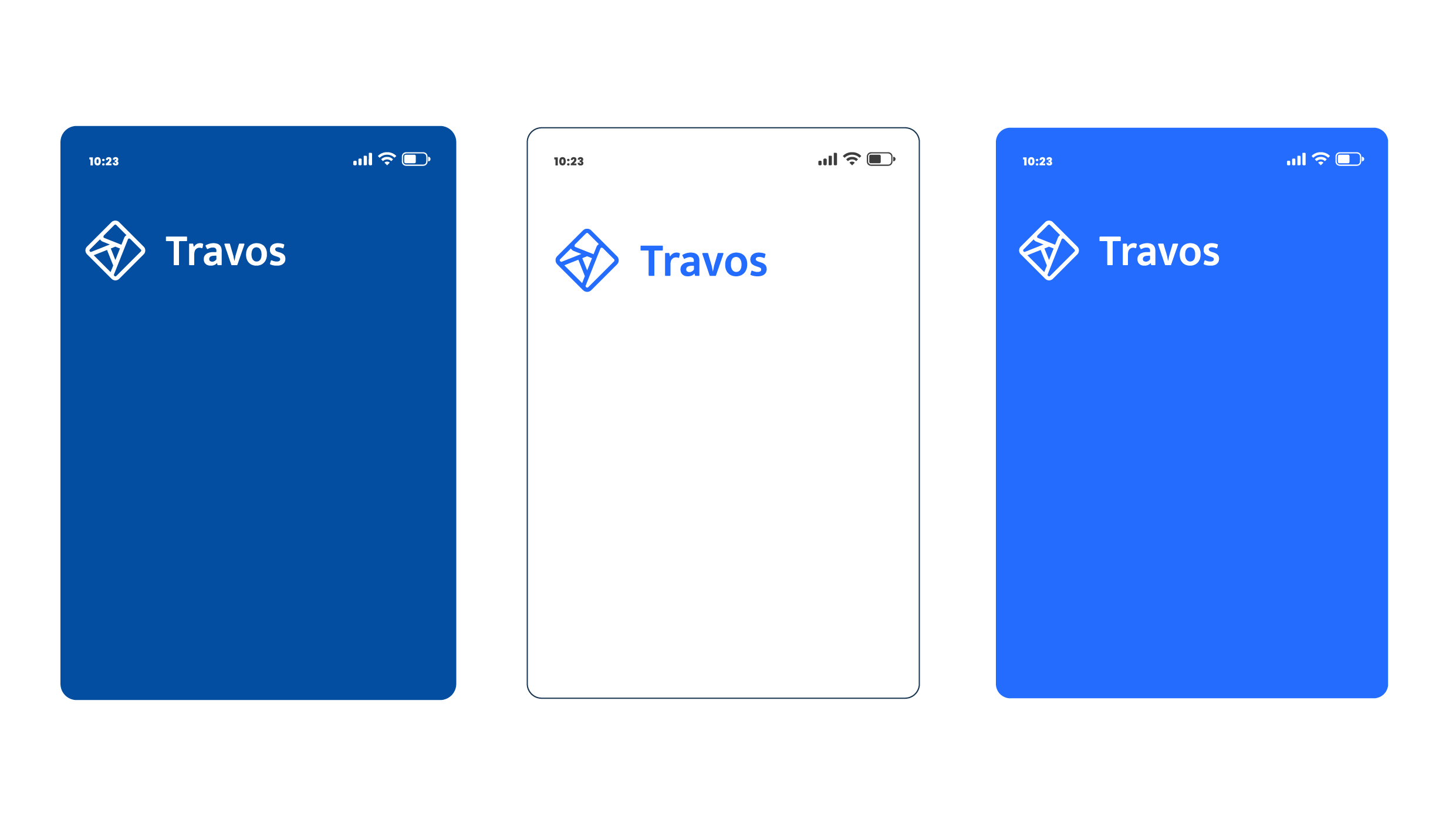
For web use: The light blue (#246CFE) and white combination evokes trust, innovation, and clarity, important for digital interfaces.
For print and corporate use: The deeper blue (#034EA1) exudes professionalism and reliability, balancing the modern feel with traditional business tones.
The additional neutral grays provide a sophisticated, professional contrast, emphasizing practicality.
Typography: The bold, sans-serif typeface gives a modern, approachable feel, further supporting Travos’s user-friendly, solution-oriented approach